Tuesday, 27 March 2012
Monday, 26 March 2012
Evaluation [Question 4]
Below I put the link from the SoundCloud. By clicking the play bottom you will be able to listen to my Question 4 - Evaluation.
Evaluation [Question 3]
Below I attach PowerPoint Presentation where I am talking about the things I have learnt from our audience feedback. If you want to read in depth about the audience feedback we got from from our target viewers - click here!
I am using Slideshare.net in order to present what I have written in my evaluation.
I am using Slideshare.net in order to present what I have written in my evaluation.
Evaluation [Question 2]
Below I attach my Question 2 - part of the Evaluation. I recorded by voice using SoundCloud Services.
Sunday, 25 March 2012
YouTube - Uploading Result
When the music video was finally finished and all the changes consider the audience feedback were made, we decided to put it on YouTube. The aim of this was to present the music video to the wider audience around the world. We were really surprised, because in the first 24 hours from uploading the View Count was showing: 150! which is quiet a lot for a music video for the artist like Jamie T who is not that well known in the whole of United Kingdom and the rest of the world.
After we decided to put the music video on to Facebook and Jamie T's Official fan page. The aim of this was for other fans and him to actually watch the music video and comment on it which would also help us when it comes to audience feedback after the publish of the video. It would also be useful for the artist to promote his music again, because the last music video he made was about 3 years ago and since then he did not do anything.
As you can see below in the image, we also got about 3 likes in the first day which means that people really liked. As there is no dislikes we may think that people got the main message of the music video as well.
 |
| Print Screen of our music video page on YouTube |
Friday, 23 March 2012
Problems Faced in Group Work
There are many problem that you have to be prepared to face while working in the group when there is more than two of you in the whole production company. The first thing I experienced was the avability, not only the artist acting for us, but the group members.
1) Avalability of the group members: As we worked in 3's. Planning in advance was never working properly. This is because every one of us had his own problems: family issues/work. Therefore we were not always available. Because we are very bonded group we were never filming if one of our members was not able to come, because then the ideas that he might have about the specific would not be said. So we planned everything 2-3 days before and we all made sure that we don't have any unexpected schedule for the weekend when we need to film.
2) Avalability of the artist: Because our music video is mainly based around one artist, there was a lot of filming needed to be done. The performance scenes which take a lot of time had to be planned a lot of time. Our artist Sam was not always able to do some of the filming due to his ilness/work and other important events including family events. This slightly let our schedule slip a week forward, but it should not impact the final result of the video.
3) New editing software: Because this year we were introduced to new, more complex editing software my group members and I were not ready to use it straight away. The problem it has caused was each of us taking some time trying to learn the basic functions, so we can then edit some small bits when rest of the group is not in. We went from iMovie HD to Final Cut which is better and gives us more options when it come to special effects and overall editing.
Progress of Making Artwork [Reflection]
The first thing that we had to consider is: Shots Options/Choice
After we have taken all the photos, we had to be clear on what kind of photos are going to be put on the front cover, initially we wanted like a mood board of photos but then that idea was changed into something more ordinary and original. We decided to use only one shot of the whole band.
This shot was then going thought the process of editing in the software that we never used before: Adobe Photoshop. This let us to do great things with only one photo and be able to change things around if they did not suit into the whole artist's image.
During the making process we also considered the use of font for the logo. You can read more about the logo options and the reflection Here!. We really careful had to choose where to put already chosen logo, so it is well visible and can be recognisable by the audience and all the fans. So this took us some time too, to actually think of a right place on the front cover to place it.
Another reflection that I have on the process of making was the idea that we had to put the front cover which was JPEG Normal Size Photo, into normal CD format. For this we researched the sized of a normal inside cover of normal CD and we changed the measurements in order for the print version to fit in. We could have used a software to do, but we decided to do it on our own to gain some experience in the future projects.
The last point that I have is that by using the previous software that I have talked about: Adobe Photoshop we were able to play/edit the whole picture when it came to shades/blurs/textures/lighting. This let us to change the look of the front cover a bit and make it a bit vintage. We had many options and design of the main photo, before even thinking that it will be our front cover. You can see them on a group blog here!
How Product fits in Context [Reflection]
In this post I am going to just briefly write some reflections about how our final music video fits well into the context which includes: the music genre the music video was made/target audience.
First, I am going to start with the genre:
I am 100% sure that our music video fits into the genre that our clips of this type are done in. The main genre of the music video was indie/alternative with it roots of rap/hip-hop music. All of that boxes are ticked in our music video. When you look at the music videos that are similar in some way to our one, you can see a lot of similarities. After we have finished the music video, I have decided to go on Jamie T's Official Website to watch all of his music video that I/We as a group have never watched before, because we did not want them to influence what we doing and have an impact on the editing and the symbolism. When you compare them you can see that they use the same kind of shots and they use a lot of people in it, so the artist can relate to them. Below you can see the similarities that I am talking about :
Another point that I am going to mention is how the music video fits withing our dedicated audience and age. During our discussion we have decided that our target audience will be people (teenagers) at the age between 15-19 who can relate to him in many ways. They have desire to live the same life as the main artist and therefore they will start to his music, but that doesn't mean that it will have bad influence on the audience. As you can see during watching of our video that the character is dressed in the way, so he looks like he on his own is like 17-18 years of age. This means that people that have the same style of clothing and listen to the same kind of music are most likely to like it and find many similarities between our music video and other ones of the same type of genre.
First, I am going to start with the genre:
I am 100% sure that our music video fits into the genre that our clips of this type are done in. The main genre of the music video was indie/alternative with it roots of rap/hip-hop music. All of that boxes are ticked in our music video. When you look at the music videos that are similar in some way to our one, you can see a lot of similarities. After we have finished the music video, I have decided to go on Jamie T's Official Website to watch all of his music video that I/We as a group have never watched before, because we did not want them to influence what we doing and have an impact on the editing and the symbolism. When you compare them you can see that they use the same kind of shots and they use a lot of people in it, so the artist can relate to them. Below you can see the similarities that I am talking about :
 |
| Jamie T - Sticks and Stones Official Music Video |
 |
| Our Music Video (Jamie T - Ike and Tina) |
Another point that I am going to mention is how the music video fits withing our dedicated audience and age. During our discussion we have decided that our target audience will be people (teenagers) at the age between 15-19 who can relate to him in many ways. They have desire to live the same life as the main artist and therefore they will start to his music, but that doesn't mean that it will have bad influence on the audience. As you can see during watching of our video that the character is dressed in the way, so he looks like he on his own is like 17-18 years of age. This means that people that have the same style of clothing and listen to the same kind of music are most likely to like it and find many similarities between our music video and other ones of the same type of genre.
Album Artwork [Overall Evaluation]
 |
| Freddy&TheLetdowns Album Artwork [Digipack] |
- I think the artwork is very effective, because it show the background information about the band and the whole music that they are in to. The people that would like to buy the album are being welcome by the faces of all of the band members. This makes an effect of an artist ensuring that it's worth buying the whole album by putting his face to the front. It also shows the mood the album is recorded in as well as the music video eg. clubbing/partying/drinking/hangover mood.
- In case of design, we did it the way so part of the image is in dark and another one is in the light, so it will be easy to putting the logo of the band and the title of the album in the darker bit. As you can see above we put the logo and all of the writings in white so it stands out from the photo and it is easy to read it. The name of the main artist is also made bigger, so if people are looking for his music they see his name first and then the backing up band below the main writing.
- The front cover also shows the pub which can be easily recognised by the fans from the music video of "Ike and Tina". We put the location there on purpose because it is easier for people to connect all the facts&information together and make up their mind about the band/album and the whole artistic side.
- The font that has been used in the front cover looks like it is hand written. We did it on purpose so it actually fits into the style and it links to the letter writing (NHS letter) which is seen in the music video.
- There is also more light added to it, so the audience will get the sense of partying life/hangover mood of the artist. Also there is some symbolism. The "&" symbol looks like it's a music symbol. This symbolises the artistic side of the album artwork.
Choices made during the artwork construction [Discussion]
There were many choices that we had to keep up with while making the choices of which of the artwork we should use and how we should make so it is connected to the whole music video style eg. artist image/lyrics/overall message.
The first we have decided to do is to choose all the shots that represent the whole of the group. So the rest pf the photos which did not include band at all or did not include one of the band member were put into one corner, so they can be later used when it comes to the Digipack design. This would make it easier for us, because we would not have to put a lot of photos into the front of the CD, but only have one shot which will represent everything.
The other decision that we have decided on was to take the photos/shooting in the place which is already known from the up-coming music video, so the audience will be able to reflect back on it and link everything together. We have chosen Pub in Roehampton as our primary place to take shots. The pub visually looks very ruined and it has all the signs there which are needed to show symbolism on the artwork eg. beer/no smoking sign/smashed windows.
Location Photos [Recee]
As we were sure about the music video and its genre, we had to specifically choose locations that we are going to use. This would be make the whole video look like it fits withing the genre of rock/indie etc...We have chosen from variety of locations. From simple brick fence to the old closed pub in South West London. Those locations helped us to build up the atmosphere and help to understand all the codes and conventions of our music video.
Below I show the list of all locations that we have used during filming process:
On the left you can see photo taken during filming of sex scene. This is Harry's room which was perfect for us. You can see the room is full of blue/white/red colour which symbolises three different things. Blue for me symbolises coldness/illness/cold/shock relationship which can be implied during the scene when he finds out that he has AIDS. White symbolises purity, but in this example it is just to show contrast between the girl and him. The red colour symbolises love/sex/romance for me which can bee seen throughout the whole music video.
The clinic scene was filmed by the old NHS Clinic in New Malden. The first advantage of this was because it was close to our work place, so if there was some problems with the shoots it was easy for us to re-film any needed shoots. Another thing is that the place actually created an atmosphere of a clinic and it has all the symbols and signs that tell the audience more about this place eg. place for wheelchair users and cars.
There were many times when we shot a lot of performance scenes in many places. One of them is when the performer is seating on the brick wall by the houses singing under roots of a tree. We looked specifically for the brick wall not the overall location around. This created really nice effect because the wall was high and the camera caught everything in the background eg. high building/other houses/skies.
The pub in South West London (Roehampton) was a great place to film the scene of the band and the main performer when they wake up after Club Scene. As the result of summer riots in London , the pub was closed down which was great opportunity was us to film there as the place looks really run down and old. It creates great atmosphere. That day we also did photo shooting in the same place which will be used for our front cover of the album.
 Another location that we have used was Putney Vale. The reason for this is because we wanted to use ordinary, normal location. Because Putney Vale is where me, the main artist and one of the kid live it was easy for us all to gather and film some footage during nice sunny day on Saturday.
Below I show the list of all locations that we have used during filming process:
 |
| Harry's room - Sex Scene Location |
On the left you can see photo taken during filming of sex scene. This is Harry's room which was perfect for us. You can see the room is full of blue/white/red colour which symbolises three different things. Blue for me symbolises coldness/illness/cold/shock relationship which can be implied during the scene when he finds out that he has AIDS. White symbolises purity, but in this example it is just to show contrast between the girl and him. The red colour symbolises love/sex/romance for me which can bee seen throughout the whole music video.
 |
| Clinic Scene - Old NHS Clinic building |
The clinic scene was filmed by the old NHS Clinic in New Malden. The first advantage of this was because it was close to our work place, so if there was some problems with the shoots it was easy for us to re-film any needed shoots. Another thing is that the place actually created an atmosphere of a clinic and it has all the symbols and signs that tell the audience more about this place eg. place for wheelchair users and cars.
 |
| Performance scene - Brick Wall |
There were many times when we shot a lot of performance scenes in many places. One of them is when the performer is seating on the brick wall by the houses singing under roots of a tree. We looked specifically for the brick wall not the overall location around. This created really nice effect because the wall was high and the camera caught everything in the background eg. high building/other houses/skies.
 |
| Pub in South West London |

Thursday, 22 March 2012
Poster Design
 |
| The poster of the album/magazine advert! |
Tuesday, 20 March 2012
Lyric Booklet [DIGIPACK]
Below I attach the middle part of the CD Case [Digipack] which includes pages with the lyrics written on the photos of our artist Freddy or images that relate to the band.


Our Digipack [Final]
I created the album digi pack using the most advanced software which is: Adobe Photoshop and website called Picnic which helped us to fit the images into the front and back cover. Below I attach a photo of the Digipack Template that we are going to use.
The photos which we have selected to use for the Digipack were from two different photo shooting sessions with the artist on his own and rest of the band. After further discussion during meeting of the group we have chosen to chose the folloing shots:
 |
| Digipack Template - The Design |
The photos which we have selected to use for the Digipack were from two different photo shooting sessions with the artist on his own and rest of the band. After further discussion during meeting of the group we have chosen to chose the folloing shots:
 |
| Front Cover |
 |
| Inside - Page 1 |
 |
| CD Holder - Page 2 |
 | |||
| Back of the Album |
Saturday, 10 March 2012
Plans for Artwork [idea&drawings]
The idea for the album Artwork:
The main concept for the album artwork is for it to reflect the music that is going to be put on to the CD. In my opinion it has to include the photo of the main artist and the band in the background so it implies who is the ost important person and who is the main singer in the band. Another point that I wantd to include in my artwork is some symbolism that are also included in other artist's album covers. So in the title you can see there is some symbolism in the "&" symbol which represents the treble clef.
Below you can see the artwork plans that I made which will be helpful for the future album artwork designing:
 |
| Artwork Planning no. 1 |
 |
| Artwork Planning no. 2 |
Friday, 9 March 2012
Thursday, 8 March 2012
Album Artwork [discussion]
In this post I am going to talk about the discussion that we had about our Band's Artwork.
When we did group meeting we decided that we want the front cover to represent the main artist and the rest of the group so the audience can see connection between the Freddy and TheLetdowns.
Another point that we mentioned during the meeting and discussion is that we want the front cover to show the background/life of the artist including some of the artistic symbols. We also decided to put some symbolism into the main logo of the artist, so there is no need to put too many things that can relate to music.
The last point that has been mentions by other member's of the group was to also show that the artist we are going to promote as well is local. Our aim was to include some symbolism which can be recognised by the local audience.
Wednesday, 7 March 2012
Changes made in reposnse to audience feedback/reponse
After we collected all of the feedback sheets from our peers in the class and people from outside, we have decided that there are some bits that need to be changed in our music video. We wanted to be very critical of our work, even though the feedback was great which we did not expect.
Things that were changed:
Things that were changed:
- One of the comments that we got is that some bits of the music video can be a little lighter so it will be easier for the audience to see the whole video better. This made us to think more about that individual clip and we have decided that it will be easier to delete and find something that fits well with the rest. This was easier to make for us, because making the clip lighter would take some time and it would stand out from the rest of the footage as it will have different texture too. We wanted to avoid that. The final result turned out to be really good.
- Another comment that we decided to take on board was that in some clips you can hear both the music and unwanted noises in the background. This made us to go through the whole video really carefully and check where there are some bits of the footage that has not been muted correctly. This also made us to finally go through everything again and see if all the cuts are in the right place in the line with lips synchronisation.
- The audience gave us great feedback about the synchronisation in the music video, but we decided to check everything step by step, second by second so there will be no mistakes found when it will be too late and the video will be posted on YouTube for wider audience to watch it.
Monday, 5 March 2012
Reflection on Audience Response
During the end of editing process, our whole class organised to do a showcase of all of the group's music videos. Everyone has been given a sheet to fill in with a feedback after watching our music video. The viewers were asked to comment on various points including:
- the overall sychronising of the music video
- camera shots/angles
- the overall framing
- sustain of the interest
- pace of the music and the pace of the editing
- narrative
- target audience
- ....and the overall enjoyment!
From all the comments that I have read, the point that is made on each of them is the pace of our music video and the editing. It's mainly about how well the editing goes with the beat of the song which I think is really good to hear, because making a fast pace music video is not easy especially during the editing process.
Another bit the people commented about is the performance of our actor which for them seems very believable. This means that the overall performance including movement and the lipsing is really good and well presented on the screen. One of the people said: "Acting is realistic".
The other bits of comments are mainly about the whole narrative and the use of people. By reading the feedback we found out that people actually understand well the whole story, not only through the lyrics but also through what they see on the screen. One of the people said: "Engaging, funny with the use of kid police...Good narrative". The other thing they commented on is the use of lighting in our music video. It seems that people quiet enjoy the colors and the effects that has been used to create and atmosphere in the video. Someone said: "The lighting is amazing..." We also got good feedback about using a lot of people which makes the music video more interesting and there is more to watch. Our classmate Ishma said: "I liked the lighting and they used a lot of people in it which made it more interesting".
Friday, 2 March 2012
Audience Response to Music Video
Below I uploaded scans of Feedback Sheets that were filled in by our class members. They found some to time to watch the whole 3 minutes of our music video and then they were asked to fill it in carefully, so we will benefit from the comment and will be able to make some changes so the video will fit into our target audience too.
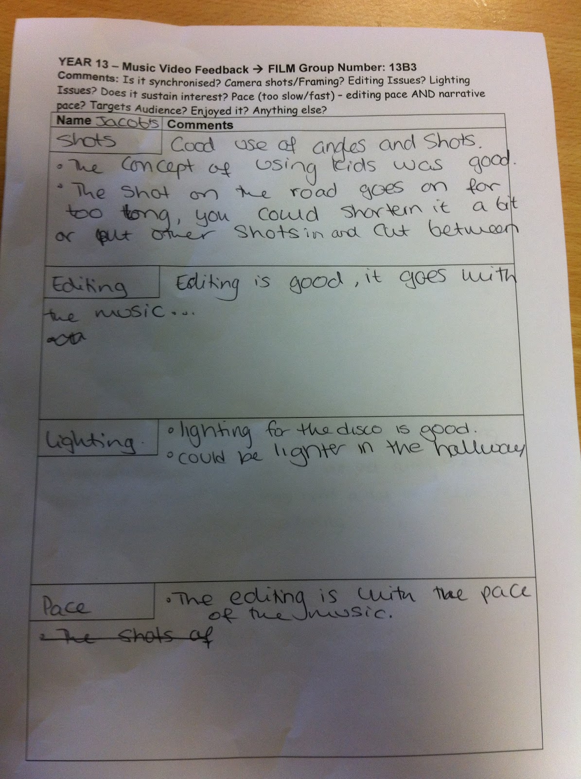 |
| Page 1/4 of Audience Feedback |
 |
| Page 2/4 of Audience Feedback |
 |
| Page 3/4 of Audience Feedback |
 |
| Page 4/4 of Audience Feedback |
Subscribe to:
Posts (Atom)